2016-Present
Summary
Firenock is an advanced archery equipment company with 40+ U.S. patents and a catalog of over 500 products. In the past nearly ten years, I’ve contributed in multiple areas—designing key brand and identity content, developing an innovative eCommerce platform, and establishing a comprehensive staff training program.
I now work with the company on an as-needed basis.
Roles: digital product manager, logo designer, podcast producer
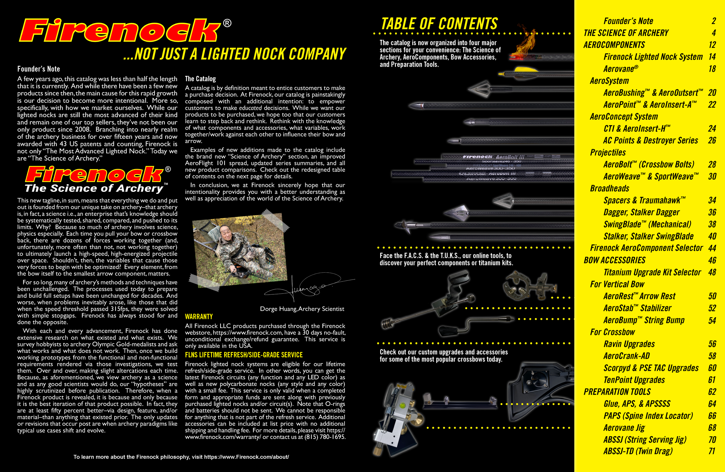
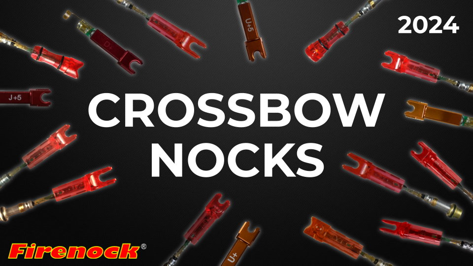
The brand Firenock is named after their first and still most popular product series, the Firenock Lighted Nock System. Their original 2007 tagline, “Firenock: The Most Advanced Lighted Nock”, was replaced in 2016 with “Firenock: The Science of Archery” to better reflect the breadth and depth of their extensive product lines. To support this shift, new logos, an updated brand style guide, and a refreshed social media strategy were developed. As Digital Project Manager, I led the execution of these initiatives, overseeing the integration of the new branding across digital platforms and ensuring alignment with Firenock's evolving identity.
Branding & Identity
Team size: Varied, largest team was 4
Logo Design
Style Guide
Social Media
Although the decision was made not to fully redesign the Firenock logo to preserve customer recognition, I led key refinements to improve its versatility and visual impact. I meticulously retraced and vectorized the original logo using Adobe Illustrator, ensuring it could be scaled and adapted for a variety of applications without loss of quality. I also developed the new tagline, “The Science of Archery,” with modern typography to better align with the refreshed brand identity. To enhance flexibility, I created multiple color variations for both print and digital use, ensuring the logo integrated seamlessly across all platforms while maintaining brand consistency.
To support the updated logo and marketing materials, I developed a comprehensive style guide that ensured brand consistency across all touchpoints. It included a curated selection of fonts and color palettes, along with detailed instructions on proper logo usage—such as clear space, sizing, and placement. The guide also established dos and don’ts for branded assets, ensuring content adhered to professional standards. Additionally, I set guidelines for tone and voice to ensure that written content was informative yet accessible, providing a cohesive direction for all team members working with the brand.
As social media has always been a key marketing channel for Firenock, I developed a new strategy to engage target customers—middle-class hunters, small-town bow shop owners, and DIY archery enthusiasts. I recommended creating relatable, vlog-style content with a friendly yet authoritative tone to highlight the educational aspect of the brand. I also focused on YouTube, creating new guidelines for thumbnails and video descriptions to boost visibility. By regularly analyzing engagement, I refined the approach to ensure it resonated with the audience. Additionally, I reproduced and uploaded all Firenock-related “Deer Gear” podcast episodes to the FirenockTV YouTube channel, further expanding the brand’s digital presence.

Roles: web designer, documentarian, webmaster
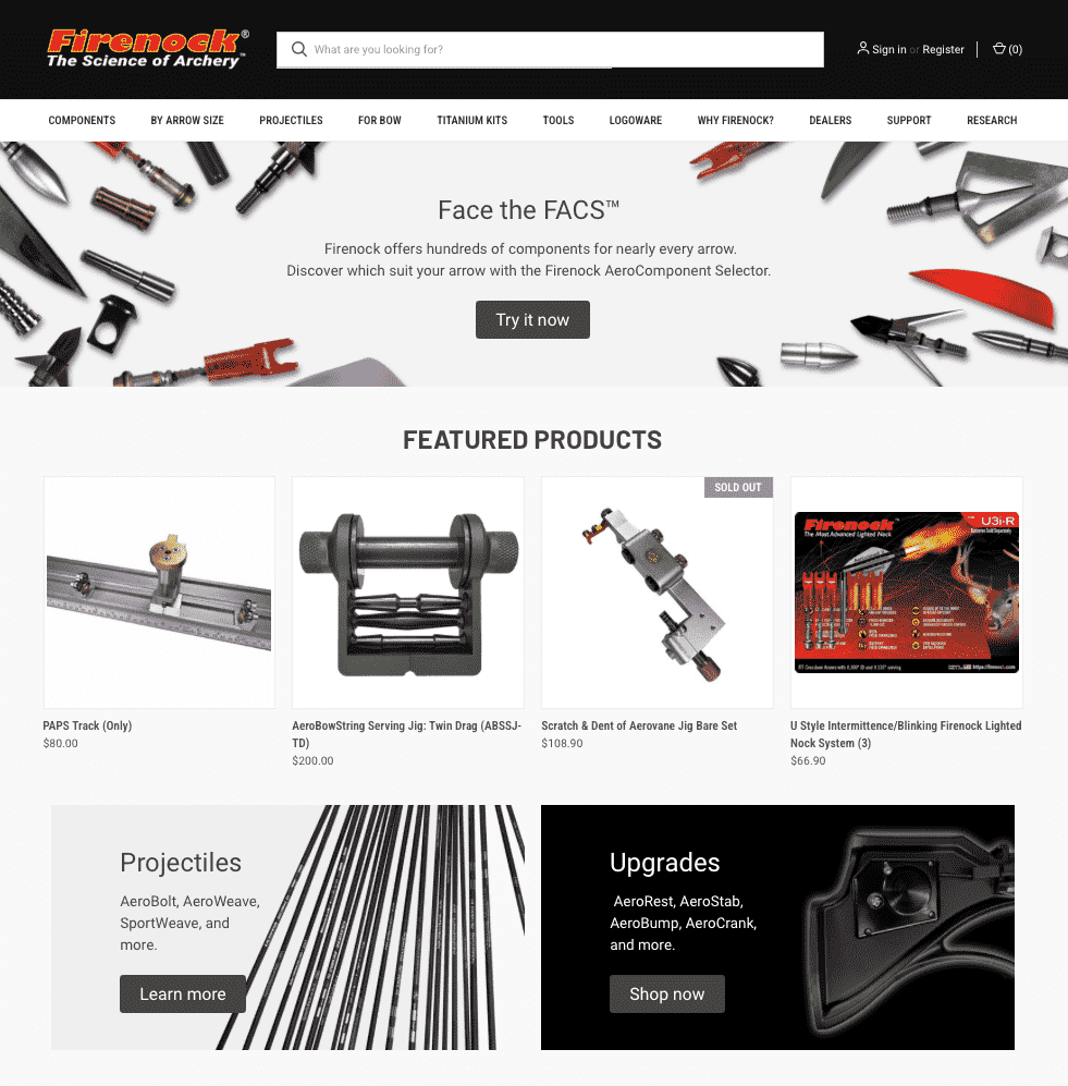
I joined Firenock in 2014, but my work on the company’s eCommerce website began in earnest in 2016. At that time, the website was built on an outdated Flash-supported platform, which was becoming obsolete. After evaluating market options and considering the company’s long-term maintenance needs, I selected Squarespace for its modern, user-friendly templates. Squarespace offered a more accessible, streamlined platform that aligned with Firenock's evolving brand identity and digital goals. However, as the company grew exponentially and product offerings became more complex, it became clear that new solutions were needed to enhance the customer experience—specifically, ways for customers to easily navigate the site and complete purchases, particularly with the increasing number of product variants.
I led both the transition from GoDaddy to Squarespace and the later migration from Squarespace to BigCommerce. This involved overseeing a wide range of tasks, from inventory population and product description development to managing product photography and editing, as well as integrating databases and ensuring the product catalog was properly configured.
Website Development
Team size: Varied, largest team was 8
Website Timeline
GoDaddy GoCentral Basic
2007-2012
GoDaddy Website Builder
2012-2018
Squarespace Advanced Commerce Plan
2018-2019
BigCommerce Pro Plan
2019-Present
Squarespace
BigCommerce
Firenock’s eCommerce website was built on an outdated Flash platform, and by 2016, it needed a transition to a more modern solution. After evaluating several options, I led the selection of Squarespace for its user-friendly interface and modern templates, which aligned with Firenock’s “cutting-edge technology” brand. Throughout the transition, I coordinated with cross-functional teams—design, marketing, and IT—to ensure smooth execution.
During the 2018 migration, I managed tasks such as populating inventory, editing product descriptions, and capturing product photography. I also maintained clear communication with stakeholders to ensure their feedback was incorporated and all steps were properly documented and understood.
As Firenock’s product catalog grew, Squarespace could no longer support the expanding needs. In early 2019 and late 2020, I led the migration to BigCommerce, which provided advanced features like multi-layered product filtering, enhanced inventory management, and third-party integrations.
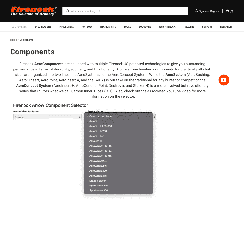
In addition to tasks similar to those performed during the Squarespace migration, I took the lead in integrating a custom backend database and interactive product selectors on the frontend. These systems allow customers to easily find the exact Firenock products that match their bow and arrow specifications. Since then, I’ve continued to manage product updates and seasonal webpage changes to keep the site current and aligned with customer needs.
Roles: Curriculum developer, program writer, video editor
In its early years, Firenock quickly shifted from big-box retailers to selling exclusively online and through vetted local bowshops. Over time, however, given the complexity of Firenock’s products—many requiring specialized tools and installation—an official staff and shop certification system became essential.
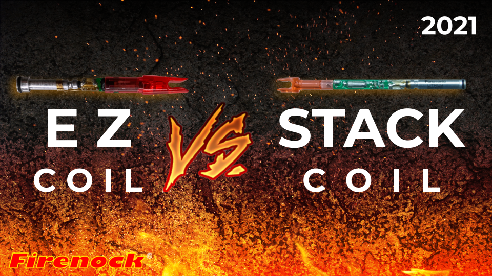
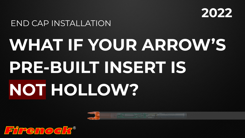
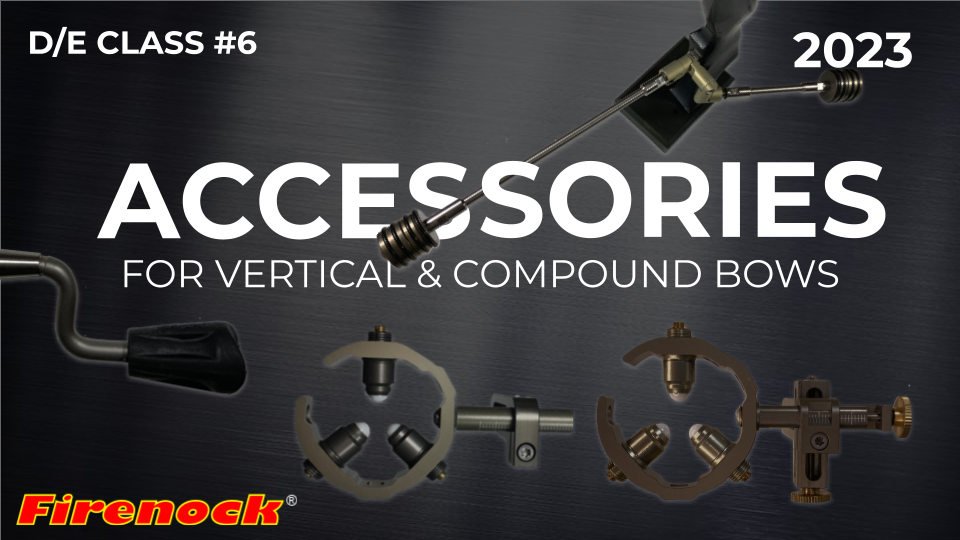
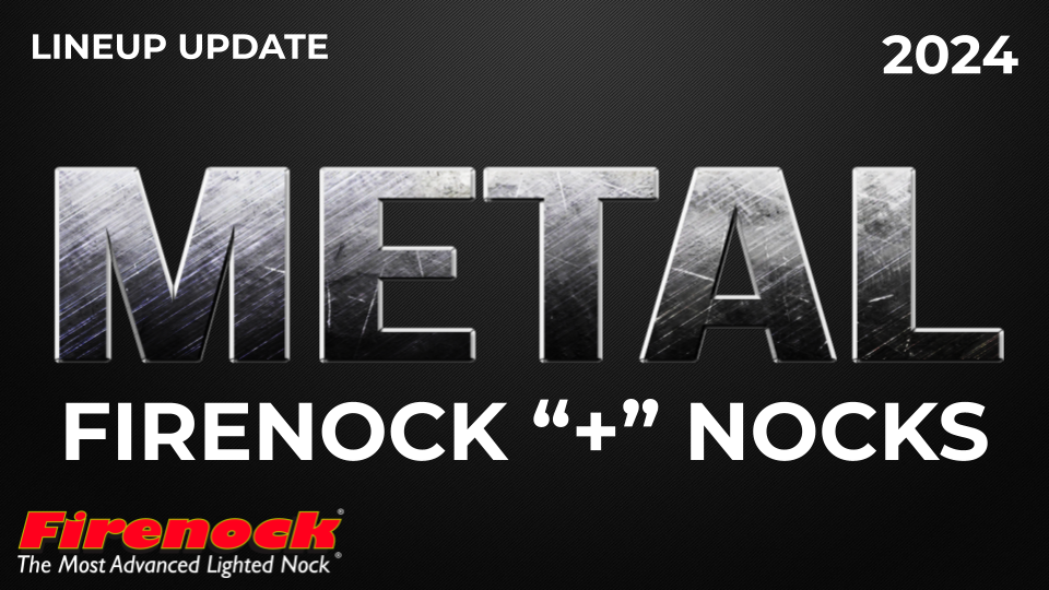
Today, the Firenock Annual Catalog (FAC) serves as the cornerstone of both the company's marketing and training strategies. Unlike typical product catalogs that focus solely on seasonal or essential products, the FAC tripled in size and doubled its functionality in 2016 with the revival of the “Certified and Trained” curriculum. With guidance from R&D, I wrote and produced instructional slides and lecture notes to accompany the revamped FAC, which now served as the core training “textbook”. The courses are filmed, updated, and uploaded every other summer in preparation for hunting season, and the FAC is refreshed every winter to coincide with the new year.
Recent Catalog Improvements
-
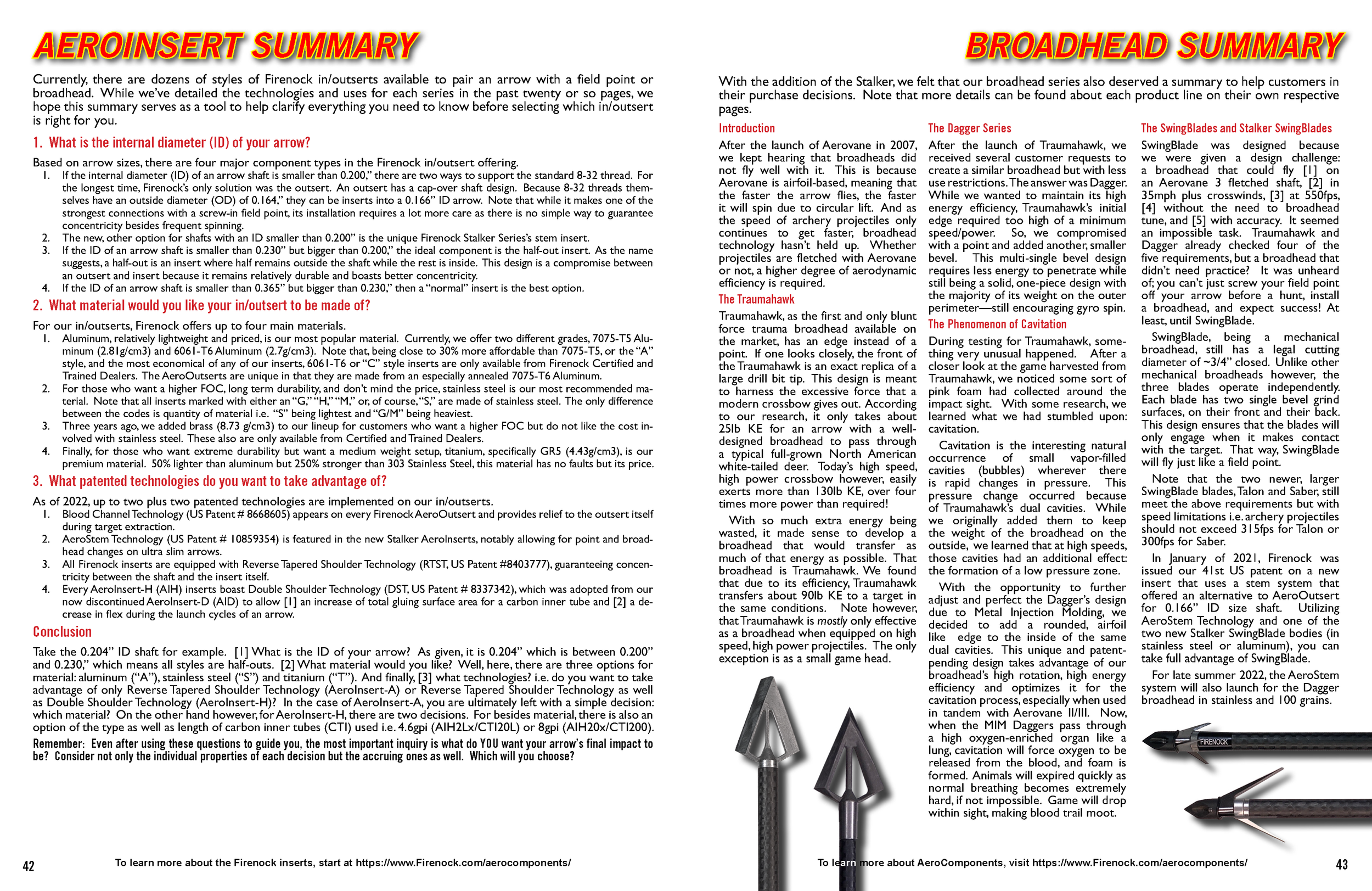
The Firenock Annual Catalog was originally organized by product release date. To enhance navigation and help readers better understand Firenock’s offerings, products were reorganized into categories like “Components” and “Preparation Tools.” Each category now includes captivating unit introductions and detailed summaries to guide customers through the catalog.
-
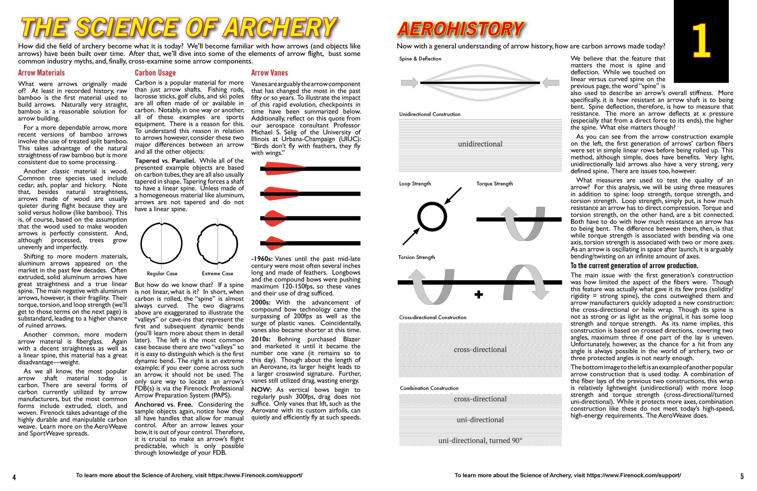
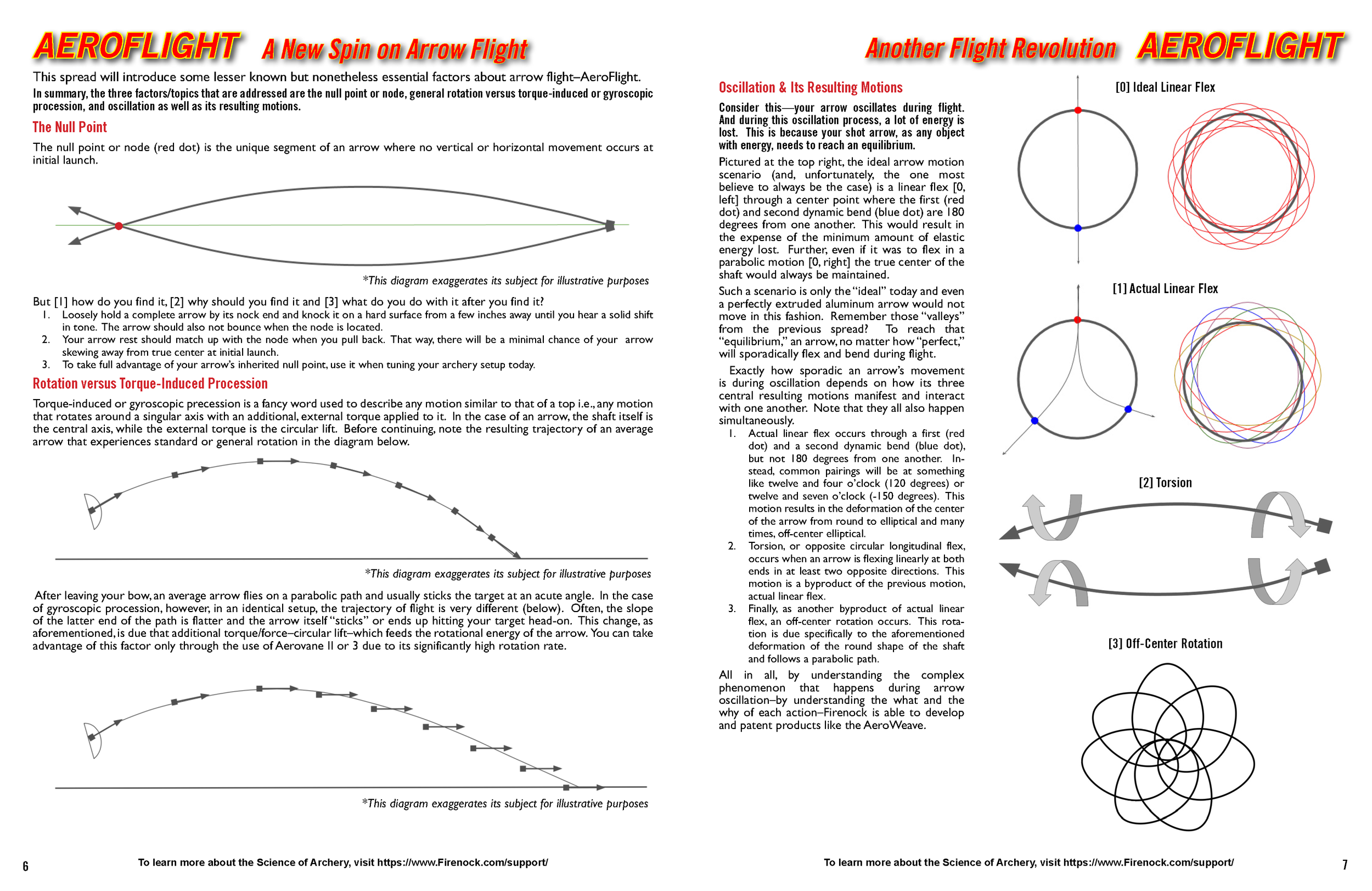
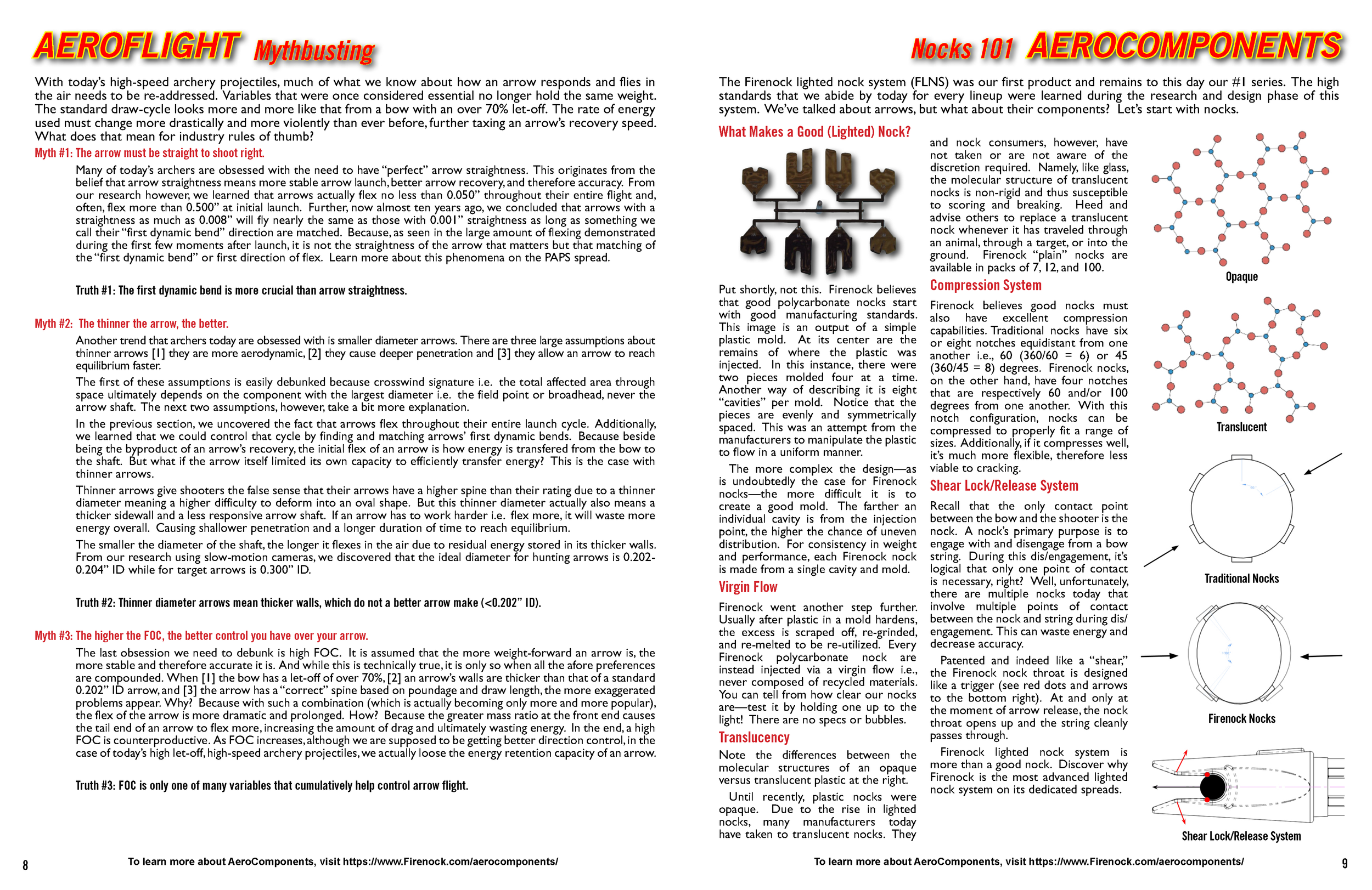
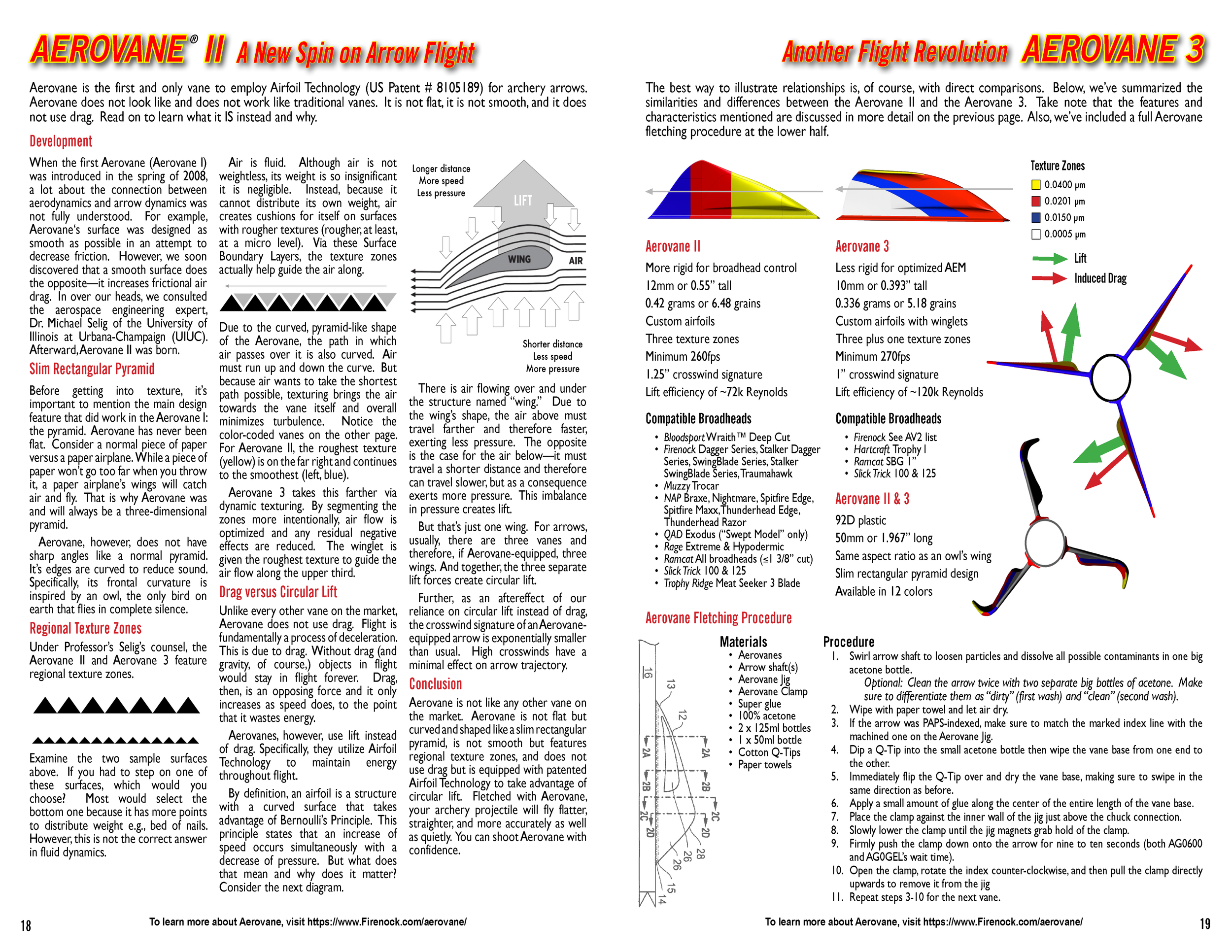
Firenock’s commitment to research and development drives its use of scientific terminology. The new “Science of Archery” section explains complex concepts in simple terms for the target audience. For instance, "AeroHistory" provides a clear overview of the evolution of arrow manufacturing processes and technology.
-
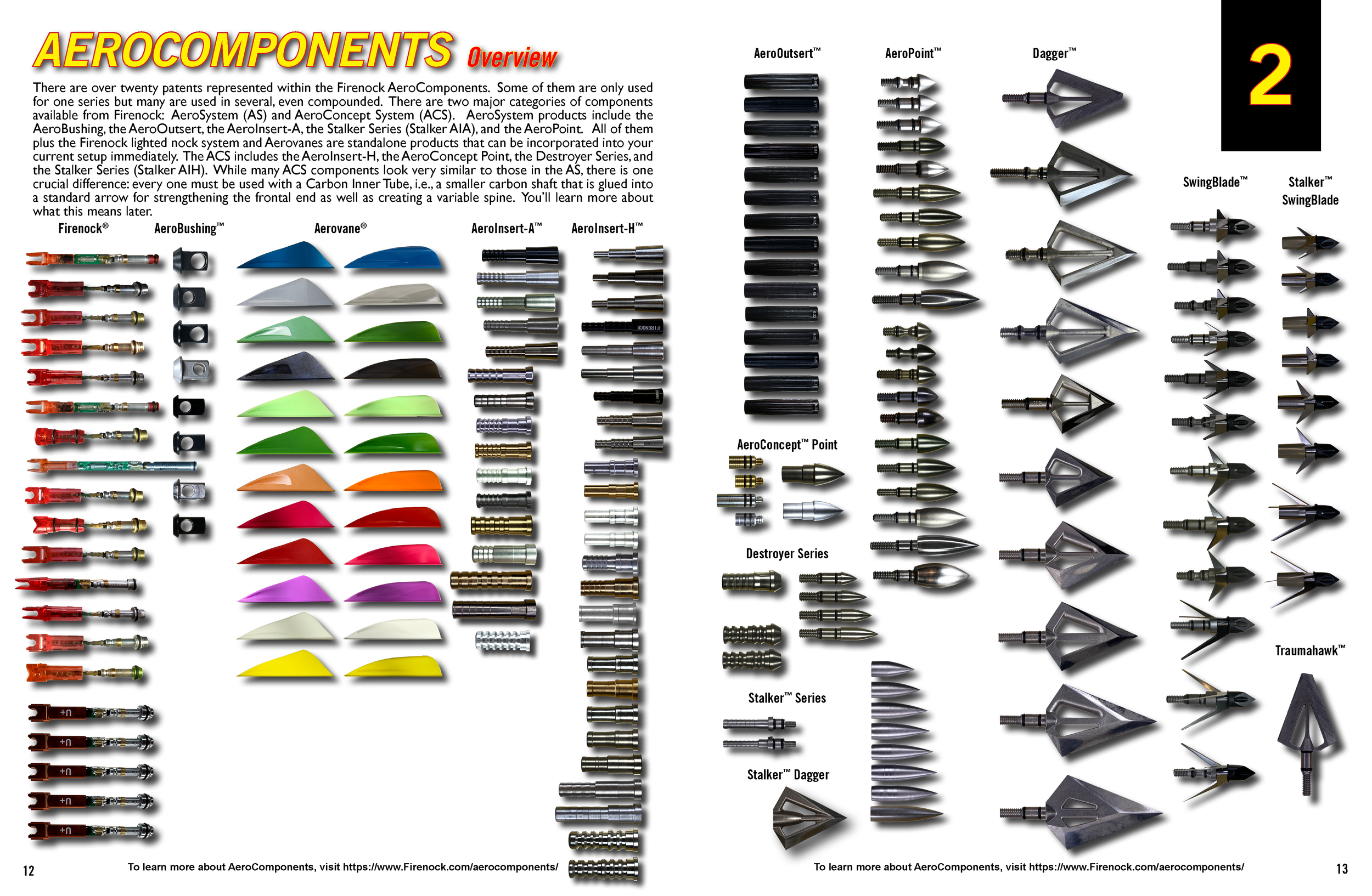
Firenock offers multiple variations of similar products, such as over 30 different arrow inserts in various materials, sizes, and patented technologies. To help customers better understand each product’s unique features and benefits, detailed overviews now allow them to view products at nearly real size. These overviews also clearly show how different systems interact—highlighting both compatibilities and incompatibilities—making it easier for customers to choose the right product for their needs.
-
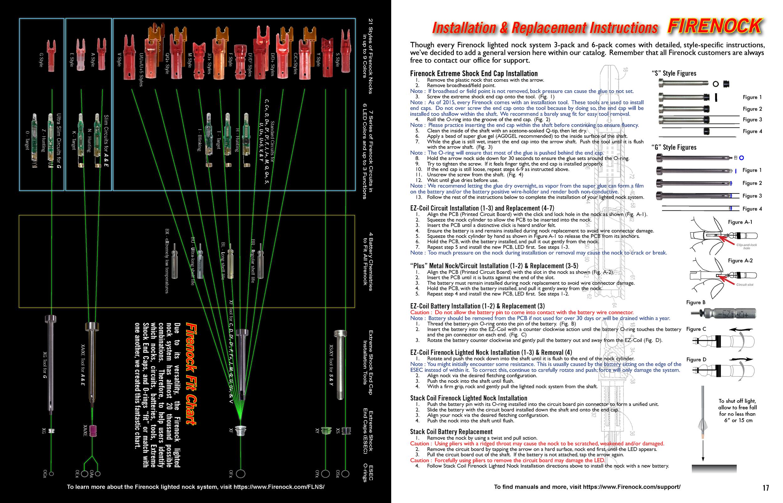
The catalog retains its classic cover design, while fonts and styles have been streamlined with updated guidelines for sizing and placement. New iconography and product "anatomy" diagrams improve product clarity, enhancing reader comprehension and accessibility.
User Support & Training
Team size: 2 (client and myself)